Sunday, June 13, 2010

Assignment 3 - Final Idea

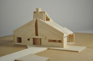
The final concept was decided to be based on the idea that photographs capture "moments" in our lives. They preserve a piece of our lives. So each element of the building is tailored to fit this idea of a lifeline, with highlighted moments in time.


The front facade has a series of metal bars criss-crossing over the face of the building, with various glass windows created by the metal bars. These windows represent the "moments" in time captured by the camera. This facade is imitated on the back face of the building as well.


This interior of the building shows the main gallery room with the stairs leading up to the workshop, store room and living area. This room has a really big window on the northern side allowing lots of natural light in. The other rooms have less natural light, and in some cases none.


This shot is from the back area of the building. This shot shows the main window allowing light into the main gallery. It also shows the skylights allowing light into the minor galleries and the rear facade.


This picture shows the interior spaces of the first level. It shows the stairs that lead up to the workshop, store room and living area.

Assignment 3 - Developments

Photographic Distortion of Perspectives

I developed a new concept that followed the premise that as a photography uses lighting, camera abilities and special angles to DISTORT the way a picture is taken in order to communicate a particular perspective to us, the gallery would DISTORT the space in which the photography is being displayed.

This required some very flexible architecture, as the idea needed to be clearly communicated otherwise the it would simply be misconstrued as a mistake in the architecture.

I decided on a gridding system for the rooms to be used that was off axis to the regular grid the building followed. To support this, angled glass windows in the facade were implemented.


A revit render of the rooftop side shows the facade on the other side of the apartment section.


This idea was abandoned as it wasn't being communicated strongly enough leaving many questions and holes in the concept. The viewer would not pick up the concept as easy it it might've been expected.

Assignment 3 - Original Idea

Terraced House

My initial concept was a photography gallery that was set in a traditional terraced house. The idea was to place photos, as pieces of history, in positoins hat they would normally be placed around a household. They were supposed to bing the building back to life with their wealth of information.

The gallery was supposed to fit into the traditional layour fo the buildings of Newtown. The Terraced house layout was also a good idea as my chosen site, Site 3, had that locked between two buildings feeling that is typical of terraced housing. That tight space between two similar buildings, yet when being within one of them it was impossible to tell what existed on the other side of the wall.


This idea had promise however it soon ran out of steam as my creativity was continually running into "walls", which I could not fin a way to go around.

Thursday, May 6, 2010

Final Submission Ass 2

Edward Hopper - Chair Car


Image(Artchive, http://www.artchive.com/artchive/H/hopper/chaircar.jpg.html, (accessed 25th April 2010)

Narrative
"Our purposes bring us together, yet we're still pushed apart."

The four characters in this image all come from completely different backgrounds. They have different lifestyles, family types, family history, life experiences. They have completely different identities that have lead them to be on this train carriage at thsi moment in time. Yet it is their distinct differences that generate a social barrier between them that stops them from interacting. They are brought together in this public space and yet, it is because of their objectives, their personal endeavours, that their interaction is hindered
.


Each of the identities is represented by a different pathway within my structure.

The first is a flat and regular path. It represents the consistent and monotonous nature of the jay job. The everyday normalities that occur with not fluctuation or change. This pathway has no incline or decline, it has simple walls with no skewing.

The second pathwya is that of the career oriented youth. The pathway is at first sheltered and enclosed, as is the life of a school child, however it opens up with no ballustrade or roof as it ascends a set of stairs. This is typical of the life of a youth as they enter adulthood. They're are now on their own, maybe not entirely, but they're now free to lead their own lives. They are opened up to the possibilities of the world.


The third pathway is that of the elderly woman. Her pathway is long and casual. It has ballustrades to protect her from falling, yet it is open to the scenery. Such is the life of an elderly person. They have done all they want to do. They have achieved and retired. They are now cruising slowly through life, enjoying all the world has to offer in the later stages of their life. They're in no rush and they take their time getting to their destination.

The fourth path is that of the businessman. It is evasive with its kink in the pathway. It is attempting to deceive you as it moves this way and then that. It's walls are inconsistent, as they have gaps and partings in them. They are able to hide behind the facade that is their countenance you see.


All the pathways lead into a central tower, which is the very train carriage they're in. However, they all enter the tower at varying levels. They don't meet "eye-to-eye", as it were in the real world. Their differences bring them into the scene with different perspectives and different views on the world. They meet in this tower not only at different levels, but with an empty void between them. Their is a hole running up the middle of the tower separating them from reaching eachother or making contact. They are in the end brought together, but as their identities are very different, they don't make contact in the common space, that is the train carriage.


Axonometric


Plan View


Elevation/Section

Ass 2 Development